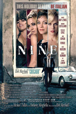
The idea behind the new poster for "Nine" is kinda cute. The whole poster within a poster thing has been done in the past to great effect (remember "Notting Hill"?)
But something about this poster is too damn selfconscious.
It is too damn crowded, there's too much going on and you don't really know where the hell you should be looking at first.
Wouldn't it have been superb if the poster featuring the women had been done in the style of the era: with illustrations a la Anita Ekberg in "La Dolce Vita"?
At least this one's better than the Korean version.
No comments:
Post a Comment