Showing posts with label Posters. Show all posts

Saturday, March 3, 2012

Sheet-y Saturday.

This exclusive poster for John Carter was designed by J.C. Richard for a special Mondo screening of the upcoming film and it's utterly perfect. The soft colors recall the excitement of finding a washed out sci-fi paperback among your dad's belongings and the detailing demands you look at it forever. The canyons, the color of the skies, the planets above, the thrill of that beam coming out of a spaceship...and then the single human being standing in awe of all of this. This one sheet makes us become John Carter and as such it's truly a work of art.

Excited about this movie?

Saturday, February 11, 2012

Sheet-y Saturday.

 Where we take a look at posters for upcoming features.

Whoever is behind this one sheet for Mirror Mirror had only purpose in mind: destroy Tarsem movies from having flawless poster designs. Check out the posters released for The Cell, The Fall and Immortals all of which were visually intriguing movies, with imaginative graphic campaigns. What we have here is Photoshop gone seriously wrong and also slightly plagiarist.
For starters, do not showcase your movie's castle when Princess Jasmine isn't anywhere to be found, wait, are you telling me this isn't the castle from Aladdin?
Next, do not have Armie Hammer look like he's still wearing J. Edgar old age makeup...he's supposed to be the prince, not Snow White's creepy stalker. Next, do not make the elves look like a comedy troupe out of a Chelsea Handler fantasy. Last but not least, don't make people believe your heroine has no arms. Unless this is also an adaptation of Wicked, Snow White was never known for her lack of limbs. Seriously, the teasers featuring individual characters were much, much nicer. 

After the overloaded disaster we just saw, this poster is absolutely breathtaking. I don't even know what the movie's about, but the way in which they captured the imminent disappearance of love (don't you want to just try and contain those falling streams from dissolving the couple?) makes me already ache for how heartbreaking this movie will be.

What's your take on these puppies?

Saturday, January 28, 2012

Sheet-y Saturday

Where we take a look at posters for upcoming features.

Whoever is behind the marketing campaign for Shame most certainly knows what he's doing. Each of the film's posters have been more brilliant than the previous and they all sum up the film's concept without recurring to using Michael Fassbender's face. Take this Hungarian poster for example, the way the title is spelled gives it an instantly erotic level, that's mostly marked because it feels so revolting at the same time. It's sensual and exhibitionist, but it also puts into perspective the character of whoever spewed the title out. Can you help but feel deep empathy for his sorrow? The poster was banned upon its release.

Saturday, January 14, 2012

Sheet-y Saturday.

Where we take a look at posters for upcoming features.

These posters for The Iron Lady are truly fantastic, if only all campaigns were this inventive...the only thing I find weird is that they all seem to attack Maggie, as if the movie is predetermining audiences stances of her controversial legacy. I mean, someone out there might like her, no?

I couldn't care less about the re-release of Episode I, however I find it curious that they're bringing the usually classic Star Wars posters to the 21st century and using the "big head and big text" technique. Makes for a nice visual, huh?

What's your take on these two? Excited about Star Wars coming back to theaters?

Saturday, December 3, 2011

Sheet-y Saturday.

Where we take a look at posters for upcoming features.

It wasn't until I read an article on it in The New Yorker, that I was even remotely interested in watching John Carter. However the fact that it's directed by the same guy who gave us WALL-E makes me all sorts of excited. Reading about his creative process makes this poster work in all different kinds of ways. He gives us the star, the monsters and tops it all with a beautifully subdued font that somehow doesn't feel completely at home in the strange intergalactic scene. Isn't that what his movie is supposed to be about?

Angelina Jolie has never really been a particularly exciting or versatile actress yet somehow I'm very curious about what she might bring to the table as a director. The fact that this poster doesn't make her name the biggest thing about it makes me think she's trying to show the world she's more than a pair of luscious lips and Mrs. Pitt.

Excited about either of these?

Saturday, November 19, 2011

Sheet-y Saturday.

Japanese people have a strange sense of humor and very different aesthetics from us Westerners but I really can't guess what they were trying to go for with this poster for Young Adult. Between the Hello Kitty shirt and the disheveled hair there's really no big contrast. Were they trying to show that Char is up to no good but has potential? Because so far look like lazy Sunday outfits.

The looks on CaMu and Fassy in this poster say it all. They didn't even need to bother saying the name of the movie. What a superb work this is. I am dying to see this one...

Saturday, October 22, 2011

Sheet-y Saturday.

Where we take a look at posters for upcoming features.

Why would anyone try to make a Lars von Trier film feel like a cross of The Craft and a Bewitched prequel (Kiki looks like a young girl becoming aware of her powers...ooh I see some X-Men in it too!) especially after the original - and somewhat controversial - first poster created one of the most iconic images of the cinematic year.

After the awesome trailer reminded us that less is more, the graphic campaign for The Woman in Black is a joyful example of how imaginative marketers can create a mood without recurring to cheap, stereotypical techniques. Gotta love how the sepia creepiness of the eyeless children (I maintain to this day that there are few things as scary as ghost children) is almost enough to take our attention away from the ghastly presence that seems to be overtaking them! The play this film is based upon is a wonderful combination of horror and comedy, so far it seems the filmmakers are tapping onto this. 

So, what's scarier? The lazy Kiki work or the eyeless children?

Friday, June 24, 2011

Sheet-y Saturday.

Where we take a look at posters for upcoming features.

Well, gimme some, some, some o' this in a bun.
Aren't these two just truly gorgeous? This movie promises to be a superb comedy (just look at the cast!) and even if the poster isn't especially memorable, it takes a cue from the Love and Other Drugs school of "if you got 'em, flaunt 'em".

Now this, we probably won't even get to see but the poster is a work of art. It gets you curious and makes you want to know what¿s going on with the faceless man, the classic font and the overall feeling of melancholy transmitted by the image.
Then you see it's from the man who directed The Death of Mr. Lazarescu and things just click.

What are some of your favorite Romanian movies?

Saturday, June 18, 2011

Sheet-y Saturday.

Where we take a look at posters for upcoming features.


When it comes to superhero movies I'm usually completely blasé until I watch them (see how much I enjoyed Thor for example!) and I'd been even more than indifferent towards the new Captain America until I laid my eyes on this fantastic poster.
This is how you do a film poster people! The retro factor gives the film a completely different perspective and truly makes me salivate at the possibility of encountering a throwback to the Fletcher Superman cartoons for example. Can you imagine how awesome that would be?
Love the Hitler punching, the font, the colors and heck, if Chris Evans doesn't look like a young Gary Cooper in that illustration.

Do you love this one as much? Excited about Captain America?

Saturday, April 23, 2011

Sheet-y Saturday.

Where we take a look at posters for upcoming features.

Color me unimpressed with both the trailer and poster for The Help. Supposedly this is some sort of Oscar vehicle for the lovely Emma Stone but it simply looks like an average made for TV movie or late 80's drama a la Driving Miss Daisy.
The cast looks terrific (am I the only one who thinks Bryce Dallas Howard is seriously underrated?) but still, meh?
The poster continues the path of serious meh-ness featuring its leading ladies in positions to represent segregation. Emma Stone's cute look is priceless, the rest not so much.

A poster like this could make me go see ANY movie it was advertising. Gotta love the Saul Bass nod, the classy and classic tagline and even if I don't know who anyone in the cast is, I'm excited about this one!


Excited about Blame? How would you help The Help?

Saturday, April 16, 2011

Sheet-y Saturday.

Where we take a look at posters for upcoming features.


I've decided that there's just no way this movie will suck. The book is fantastic (an instant favorite in my all time list) and well, you know how I feel about Anne Hathaway.
The marketing campaign so far has been flawless, even if this is just a variation from the first poster, what a variation!
The instantly iconic image of Anne and Jim Sturgess embracing is now decomposed and made out of Polaroid snapshots, one for each year that the movie covers.
Just, wow, I'm already sobbing a bit thinking of the final product.

People, read the book!

Saturday, April 9, 2011

Sheet-y Saturday.

Where we take a look at posters for upcoming features.

I find both Kelly Reichardt and Michelle Williams to be some of the most overrated figures in contemporary cinema. However something has fascinated me about this poster for Meek's Cutoff. Despite its True Grit by way of hipsters vibe there is something almost primal in its simple design.


Now, is this creepy or what?

Would you hang these on your walls?

Saturday, March 19, 2011

Sheet-y Saturday.

Where we take a look at posters for upcoming features.

In theory I love the idea behind this poster, yet looking at it I'm not sure I like how it was executed. I think what bugs me is Owen Wilson. When you have Marion, Carla and Rachel in a movie and you still make Owen the center of your poster, you really must like him.
Love that he's in full Woody outfit though.


She is the only reason why I plan on even coming near a theater where they're playing this.

What do you think of these two?

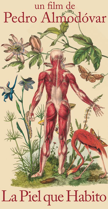
Monday, February 14, 2011

I've Got Pedro Under My Skin.


The teaser poster for Pedro Almodóvar's La Piel Que Habito (The Skin I Inhabit) was released today and as much as I tried to contain myself and wait until the weekend to talk about it, I simply couldn't resist myself...
This thing is just magnificent!
Love the retro feel of it all and the Boschian combination of the Eden-like surroundings and the human figure straight out of a medical book.
Oh Pedro, how you make me love you...

Saturday, January 22, 2011

Sheet-y Saturday

Where we take a look at posters for upcoming features.

The poster for The Son of No One tells you nothing about the movie but boy is this a nice picture of Channing Tatum.
And is it me or does the inclusion with Katie Holmes, along with Juliette Binoche and Al Pacino in the cast, sound like Tom Cruise bought her a part in the movie?


Gregg Araki is by no means subdued and the poster for his new film Ka-Boom confirms it. But I think this is the first time I've ever read the word "horny" quoted and included in a blurb.

Any of these sound appealing to you?

Thursday, December 16, 2010

Random Design.


I'm not really a fan of this movie but isn't this cover art for the Criterion edition of Topsy-Turvy absolutely fabulous?

Saturday, December 11, 2010

Sheet-y Saturday.

Where we take a look at posters for upcoming features.


Best campaign of the year? Abso-freaking-lutely!
This image of a shattered Natalie Portman is both beautiful and very, very creepy.
What lies under the cracking shell?
Each poster for Black Swan has been better than the last. Although the set of teasers made by UK design group La Boca, gets the crown...


Is that Mjöllnir in your pocket or are you just happy to see me?
Now that's a big hammer!
I have never really been a fan of Thor or any comic book for that matter and I'm not sure I'm curious as to what this film adaptation will bring us.


Any of you out there care to enlighten me why I should be into Thor?

Saturday, November 27, 2010

Sheet-y Saturday.

Where we take a look at posters for upcoming features.


Again, I just love how The Green Hornet is trying to make us think Seth Rogen is the most attractive man on the planet.
See him there, most of his face hidden by the famous mask, just a bit of scruff and a severe, mysterious look. Really, if you had no idea he was starring in this and just happened to see the poster in a theater lobby who would you think is playing this part?

Saturday, November 6, 2010

Sheet-y Saturday.

Where we take a look at posters for upcoming features.

This week featuring two marvelous actresses everyone loves to hate (and they shouldn't because they're just such magnificent thespians! And also two of my favorite actresses...)


First up is John Cameron Mitchell's Rabbit Hole which comes up with an interesting poster that could've been simply genius if it wasn't for the fact that they stuck Kidman's face in it.
I've nothing against her gorgeous silhouette but it really takes away from the creepy tire swing and the vast emptiness of the sky.
Perhaps in a way the poster does sum up the way the movie is perceived by some: an artsy drama getting attention mostly because it was produced and stars a true superstar.


There are so many bad things going on in the one sheet for Country Strong that I won't even begin to list them.
Would it have been too hard for the marketing department to come up with a cool faux concert poster for a movie about a singer? (Think Walk the Line)
Even so, why not just use Gwyneth Paltrow like they did with Jeff Bridges in Crazy Heart?
Sigh, this thing looks like a collage made by someone with no regards for lighting, human sizes and Photoshop.

Why do you think people dislike Gwyn and Nic so much these days? Every time I bring Paltrow up I'm attacked by people saying terrible things about her. The other day I told a friend she was my favorite actress and he told me I couldn't be throwing statements like that around too lightly...
Would you have reacted the same way?

Saturday, September 18, 2010

Sheet-y Saturday.

Where we take a look at posters for upcoming movies.


Now we all know I probably won't be attending Jackass 3D although the idea of feeling like I can touch Johnny Knoxville might tempt me for a while (let me be, we're all entitled to our gross little crushes).
This poster caught my attention because it's exceptionally made. The idea is simple, straightforward and the execution is marvelous. Watch how a little piece of the picture outside the frame gives the rest of the composition real depth and perspective.
One simple detail like this can spark so much curiosity from the audience who will probably want a larger, and nastier, than life experience when they attend this movie.
We could've done without the too-big 3D title, perhaps just the trademark skull would've sufficed? But the rest is poster perfection.